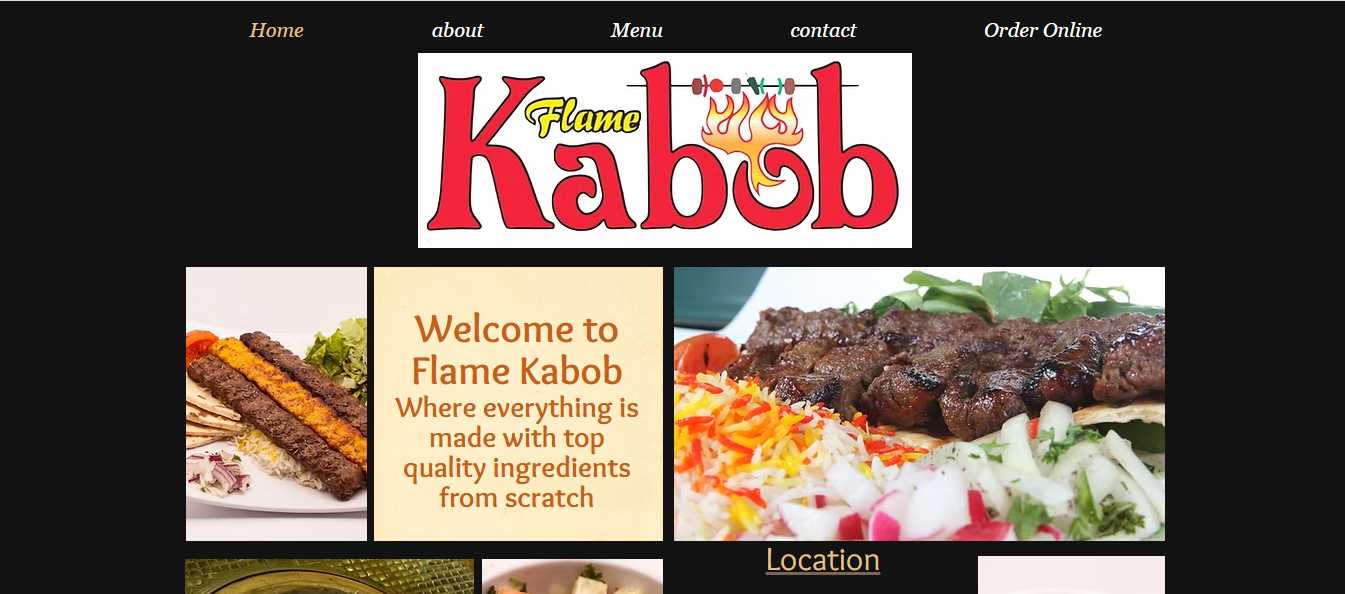
Flamekabob is a family-owned business based in LA. The aim was to re-design the website to be more interactive, user-friendly and increase online order rate.
Increasing Online Order (Due to lack of time to receive orders through phone calls)
Goals
Easy navigation for fast orders
Showcase Quality to get User Trust
To make it easier for users to get back to the website for more orders
Heuristic Evaluation
Improving navigation by
Organizing Layout
Adding Filteration
Making choices easier by increasing
Photo Quality
Accessiblity
Categorizing Information
Reduce disappointment by
Improving pickup/Delivery and purchase options
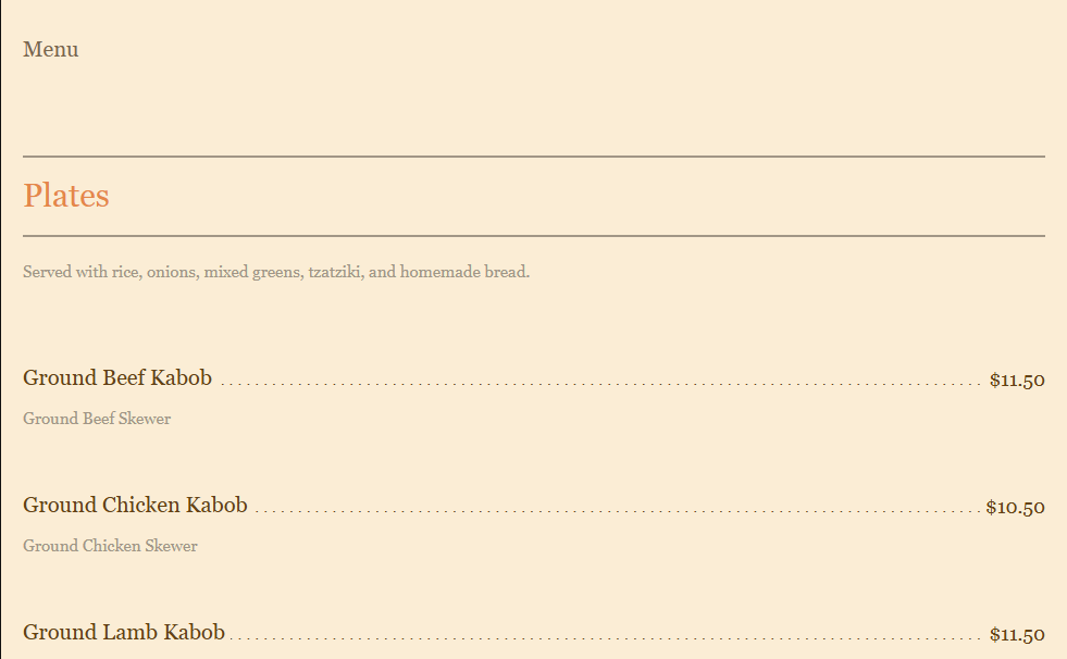
By heuristic evaluation of www.flamekabobvegas.com we figured out its not interactive and non-clickable menu and lack of filter. Disorganized layout of the homepage containing scattered information. And lack of clearity of delivery and pickup serivces and the availability of services in customer’s neighbourhood.
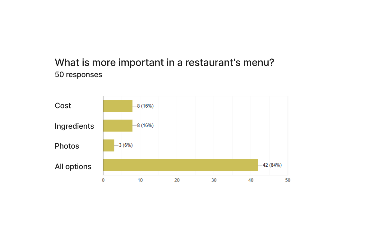
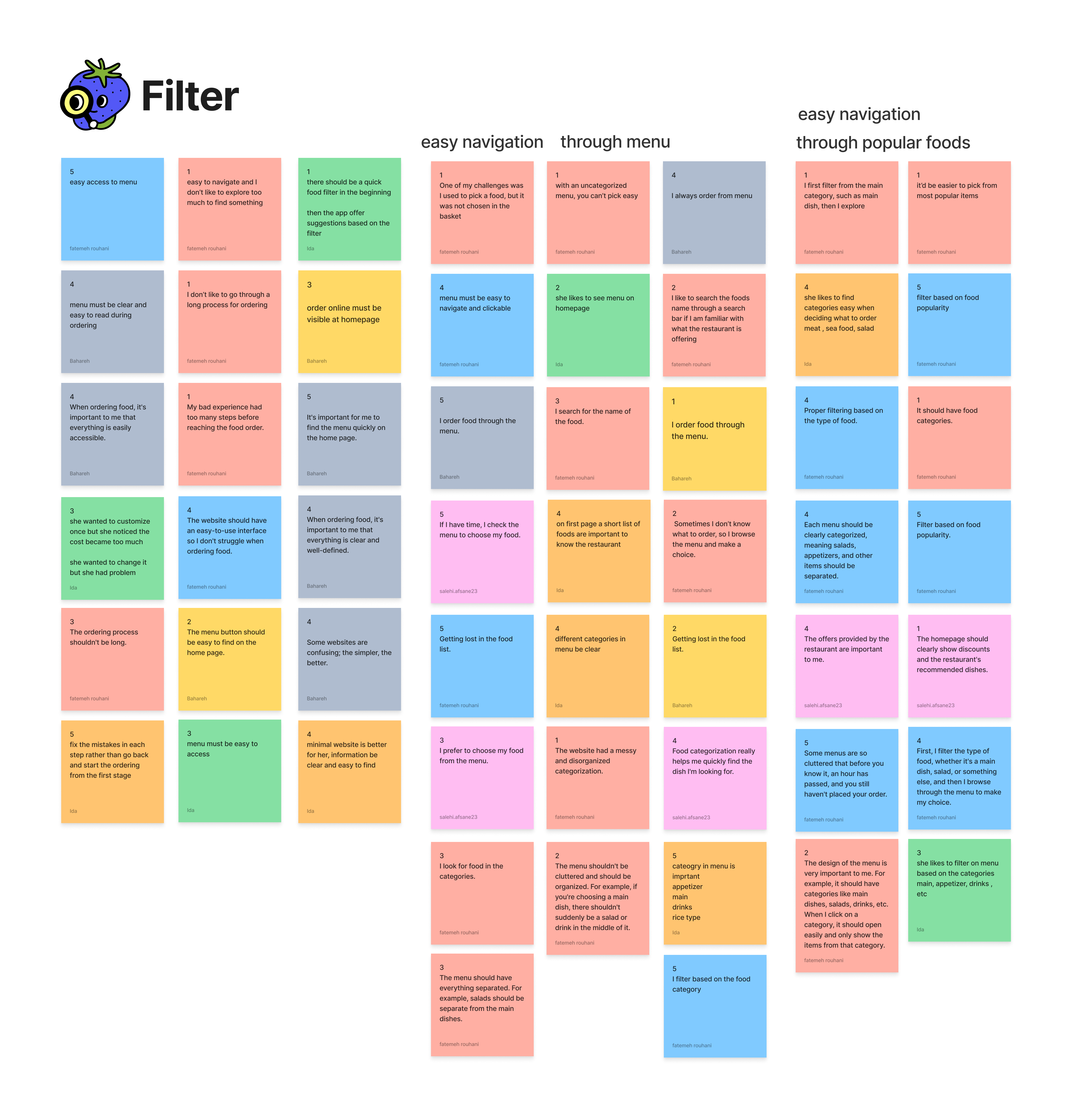
Survey Results
We tried to know what information makes users to opt for foods and might affect their choices.
So, we can highlight them or make them easy to find and more visible.
Figuring out the way customers look for items, helps us to make an easier navigation and provide options for a faster search.
Lorem ipsum dolor sit amet, consectetur adipiscing elit. Ut elit tellus, luctus nec ullamcorper mattis, pulvinar dapibus leo.
Quality & Portion
Gallery or genuine high-quality photos indicates food portion and quality of the food.
Food Details/Ingredients
Despite our expectation, ingredient is more effective in decision rather than the cost
Easy Navigation
Users would be find their desired items more rapidly if they'd be able to filter through categories and sort based on their taste.
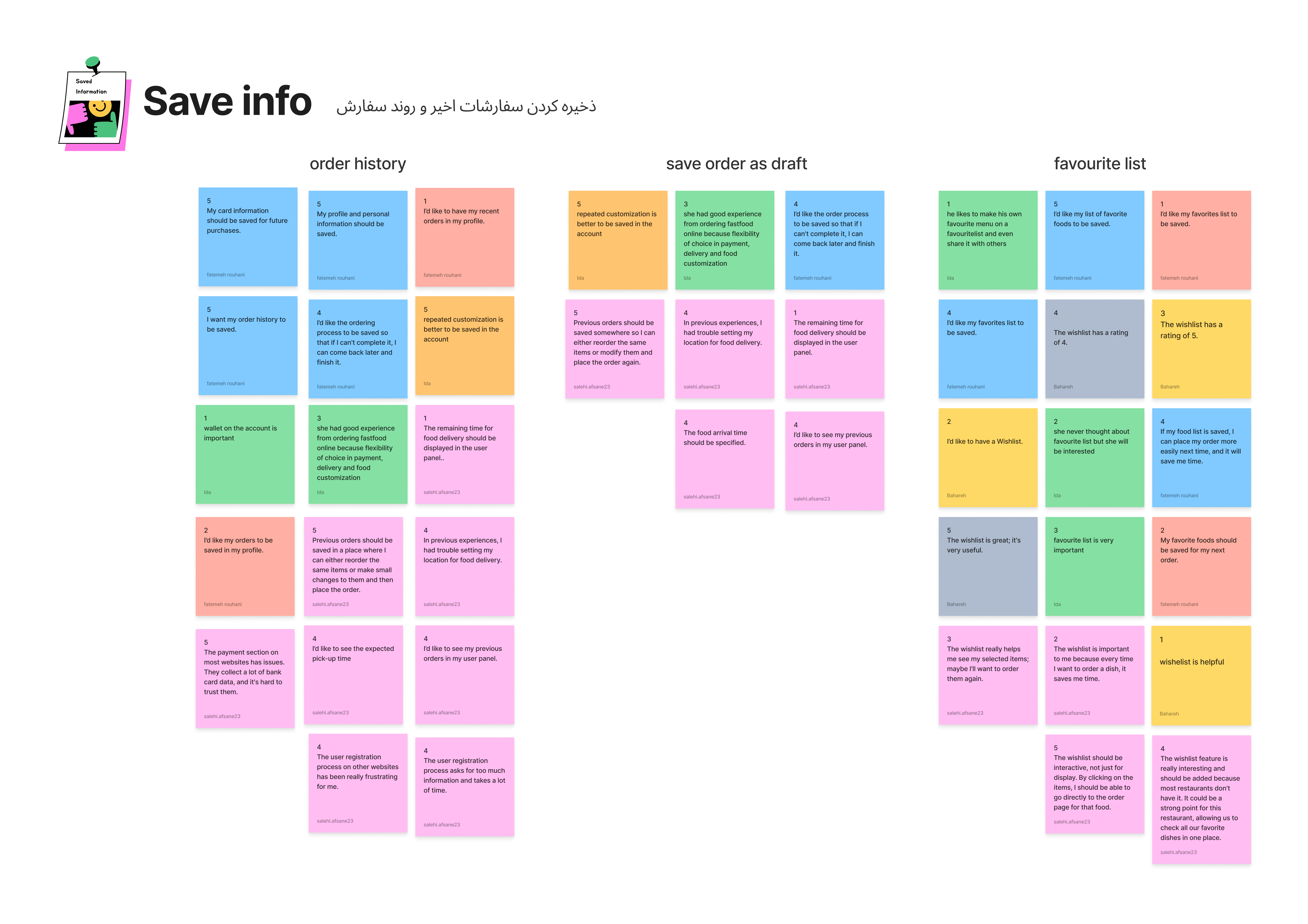
Order History
Loyal customers are prone to order repeatitive items
Some Quotes from Interviews
Quality & Portion
“Gallery is important for me because I wanna know how much is the food portion
I check the photos from restaurant staff to make sure of the hygiene.”
Food Details/Ingredients
“Food ingredients is more important because I might pick a food based on photo and it appears to be less in portion or quality as its photo might sound.
It’s happened a lot that I have guessed portion of a food based on the photo but it appears to be less than my expectation.”
Easy Navigation
“Some menus are so cluttered that before you know it, an hour has passed, and you still haven't placed your order.”
“Fix the mistakes in each step rather than go back and start the ordering from the first stage.”
Order History
“I’d like the ordering process to be saved so that if I can't complete it, I can come back later and finish it.”
“If my food list is saved, I can place my order more easily next time, and it will save me time.”
Cost vs Ingredients
“I am familiar with the price of range of the restaurant, so I pay attention more to the ingredients.”
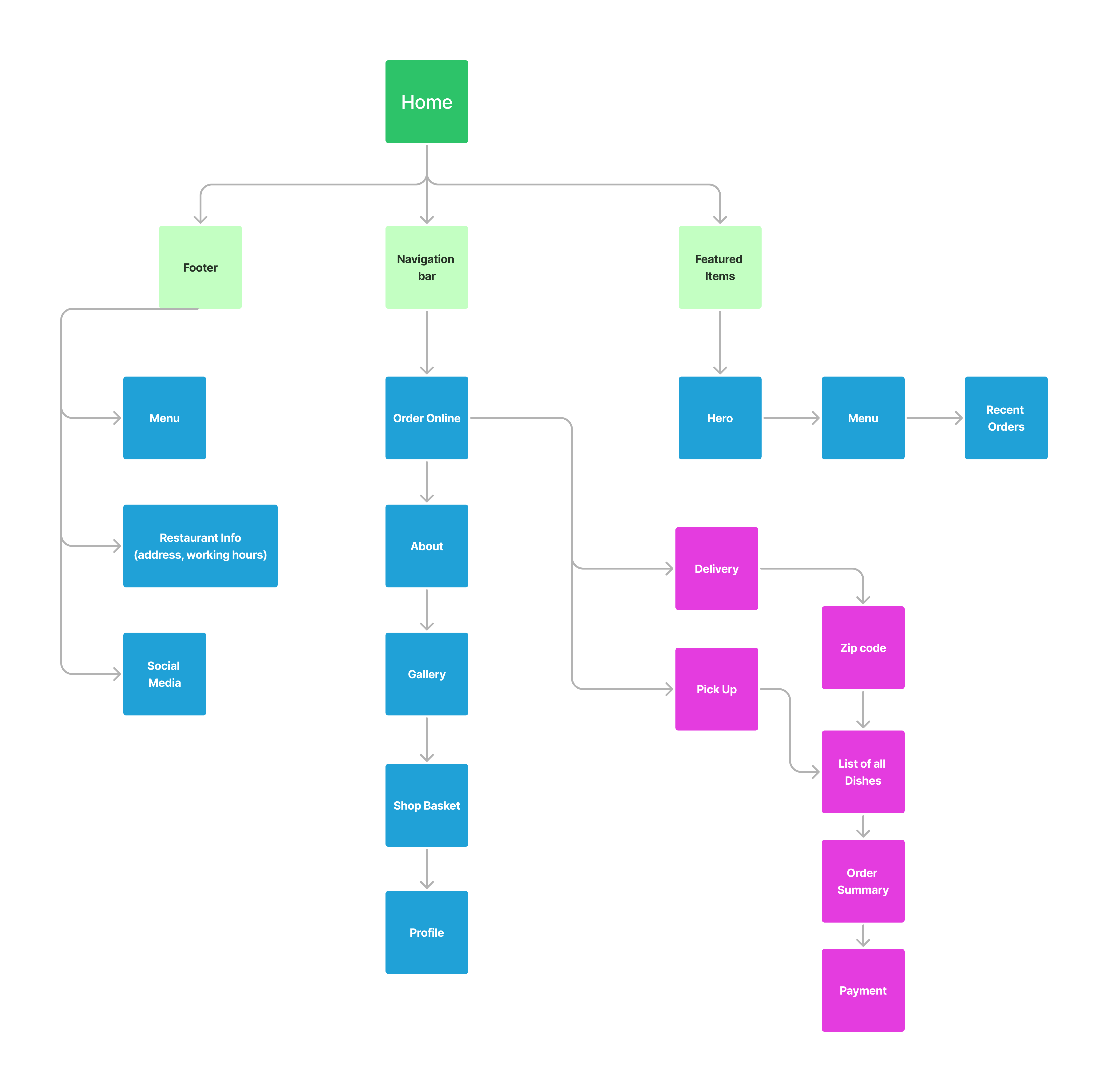
Task Flow
Site Map
Competitive Analysis
the user must explore foods at the same time and also have pick up, delivery option to choose from and have access to customizing order summary at the same time.
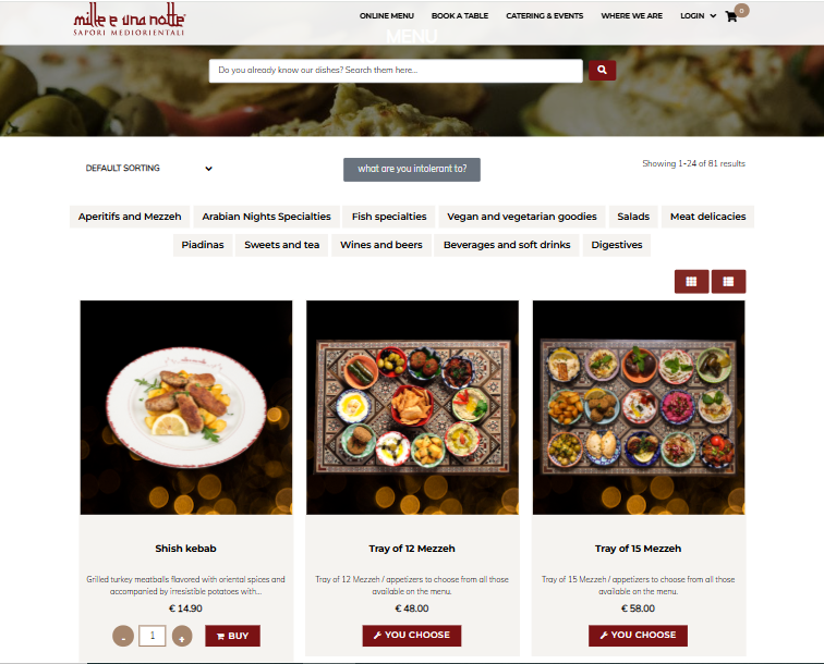
www.milleunanotte.com
It first takes you to order online menu and There is no option to ask your zipcode. So, the customer is not sure if they carry the service in his neighbourhood or if they even provide delivery services or not.
sorting and filteratons are misorganized.
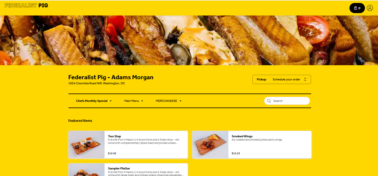
www.federalistpig.com
We got the most inspiration from user experience of this website. Pickup/delivery choice ,feedback on added new food to the basket, food customization and filters are at their right place and easy to navigate.
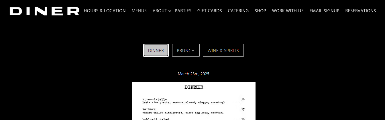
www.dinernyc.com
lack of accessibility and readibility, unclickable menu.
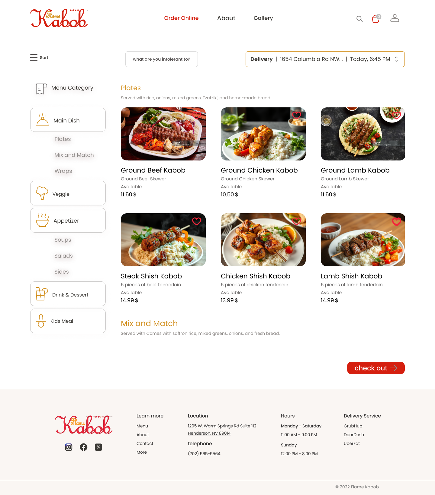
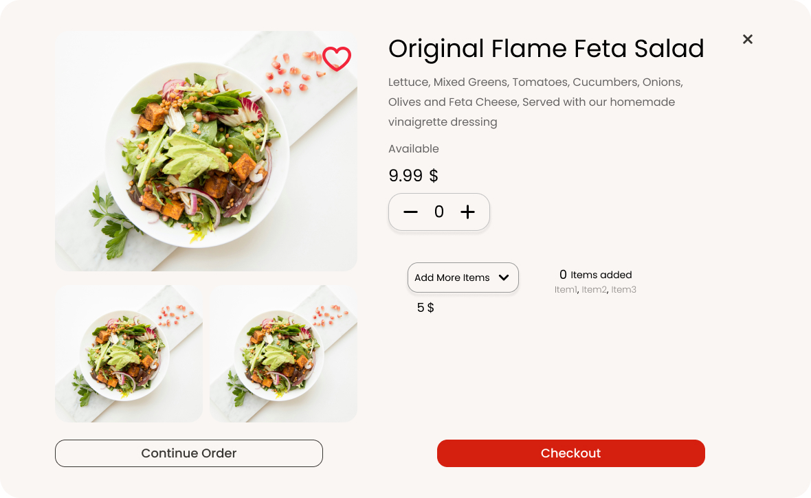
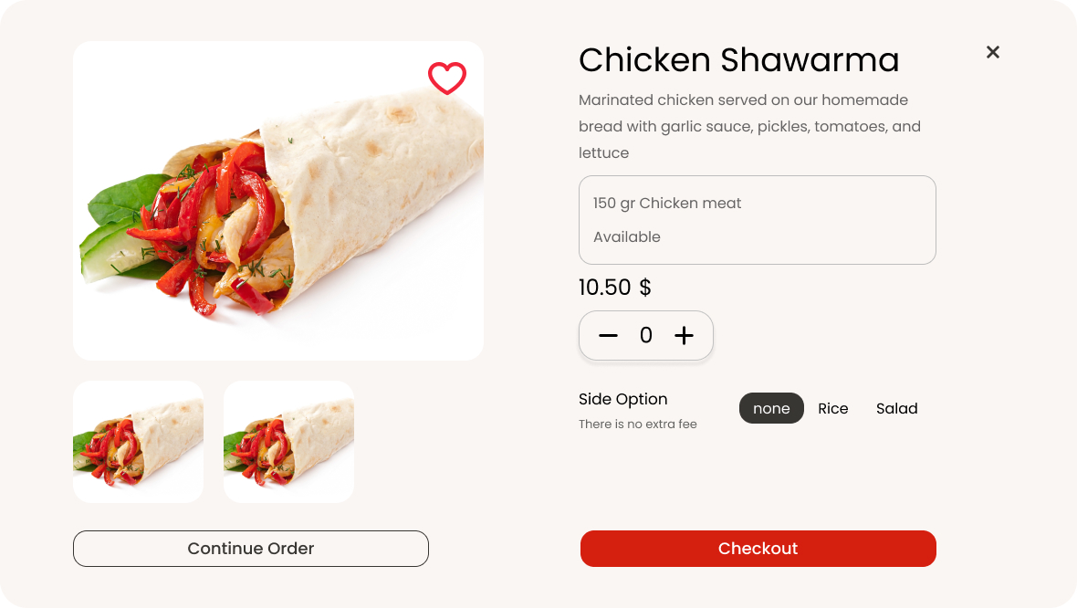
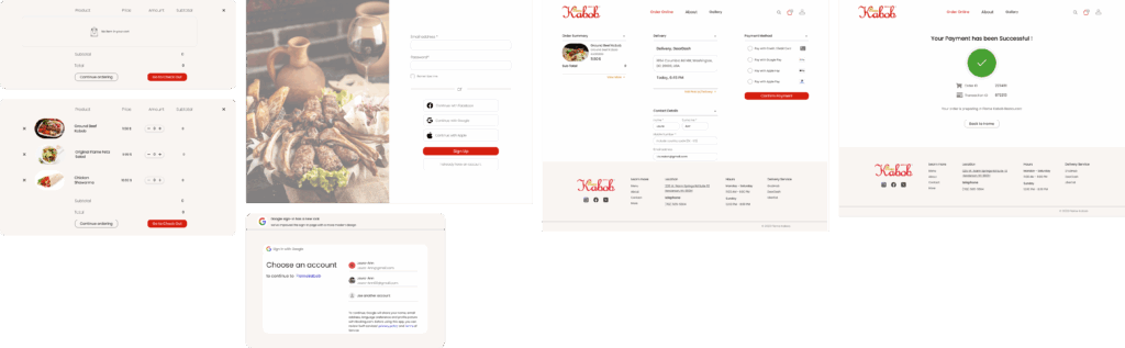
Solutions
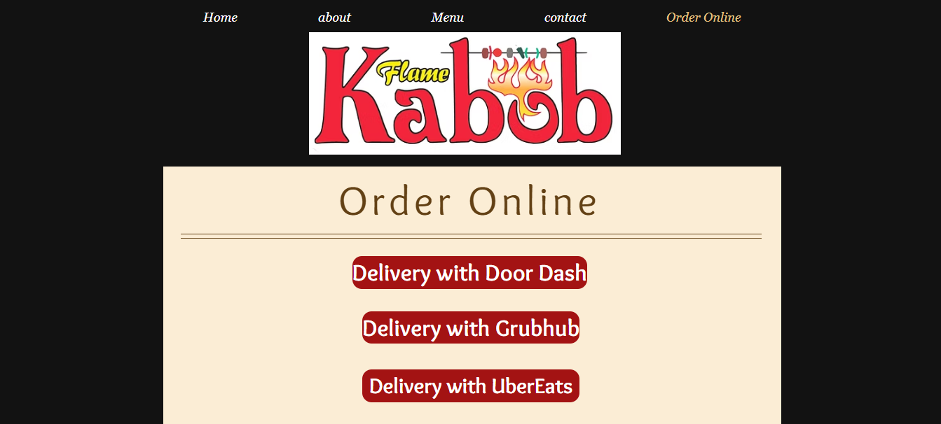
Based on A/B Testing, users were more likely to click on Order Online rather than Menu.
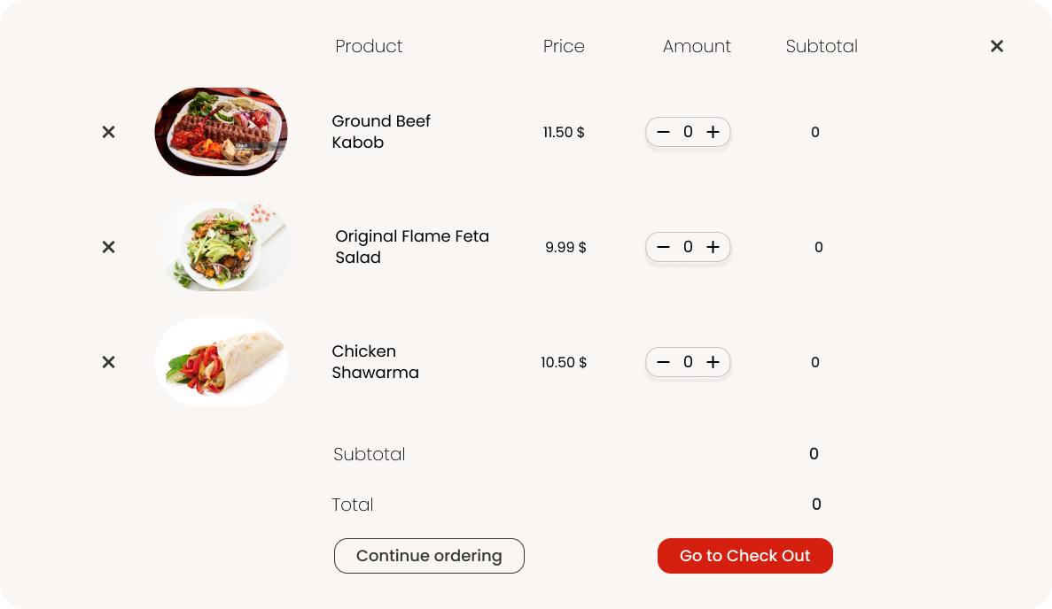
order history for the ones who have ordered online before, on homepage and also in profile section, in case they’d need to access to previous orders and customizations.
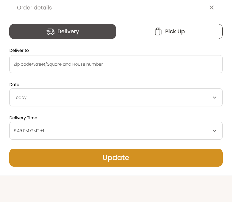
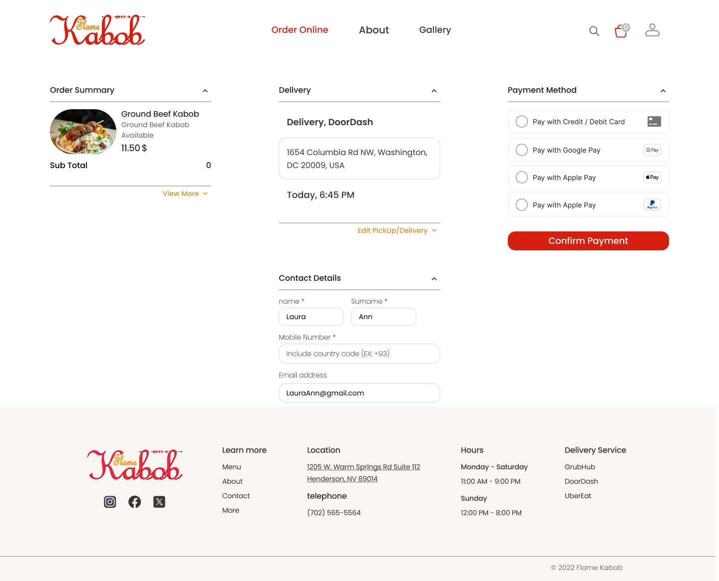
Pick UP / Delivery
The resturant might not offer delivery services to some locations, so by asking users to provide zipcode before adding orders to their basket, it saves customers time and reduces the website’s traffics.
Filter Placement
We put easy filtering and scrolling menu at the same time.
Food carts
In the second iteration, users were facing cognitive overload by too much information and options on the cards. For the Mix and Match category, users have to pick options in their choice of meat. So we added an expanded version of each cart, so customizations would be easier.
Shortcut Menu/ Order Summary
They won’t get zipcode pop up if they had saved their address and hand in preferences.
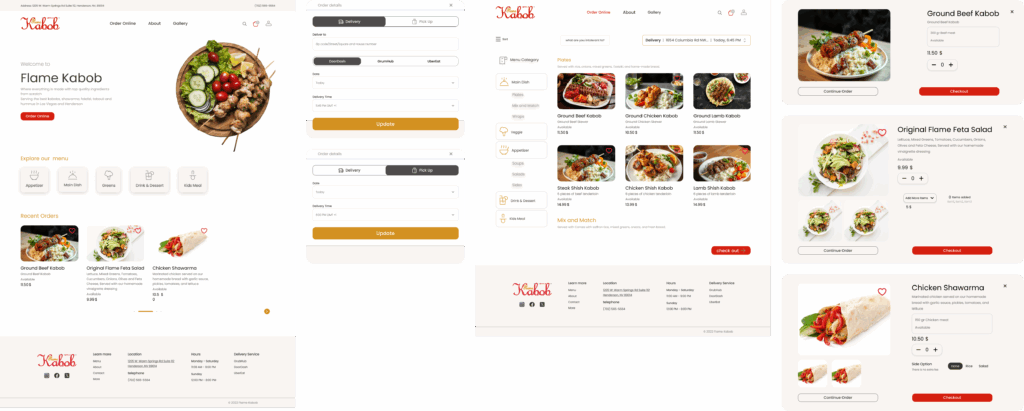
High Fidelity
like to keep in touch?
Please write to the email address below or contact me me via social platforms: