Customers who don’t have time and skills for the home repair and maintenance tasks.
They need trust and clarification over price range, time consumed and service policy.
They need fast solutions with diverse range of options.
We had to follow 2 main tasks:
book a plumber on website
book a cleaner on responsive mobile app
Survey
64 respondents
We tried to understand what gains users trust in opting our services.
It helped us to categorize services better by knowing which services are most in demand.
we realized importance of a search bar for better categorization
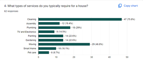
Type of most in demand services:
Cleaning
75%
Moving
45%
Plumbing
30%
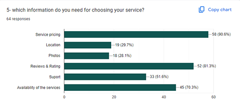
Important info to pick a service and technician:
Transparent Price
90%
Rate & Reviews
80%
Available time
70%
Importance of background check:
50% yes
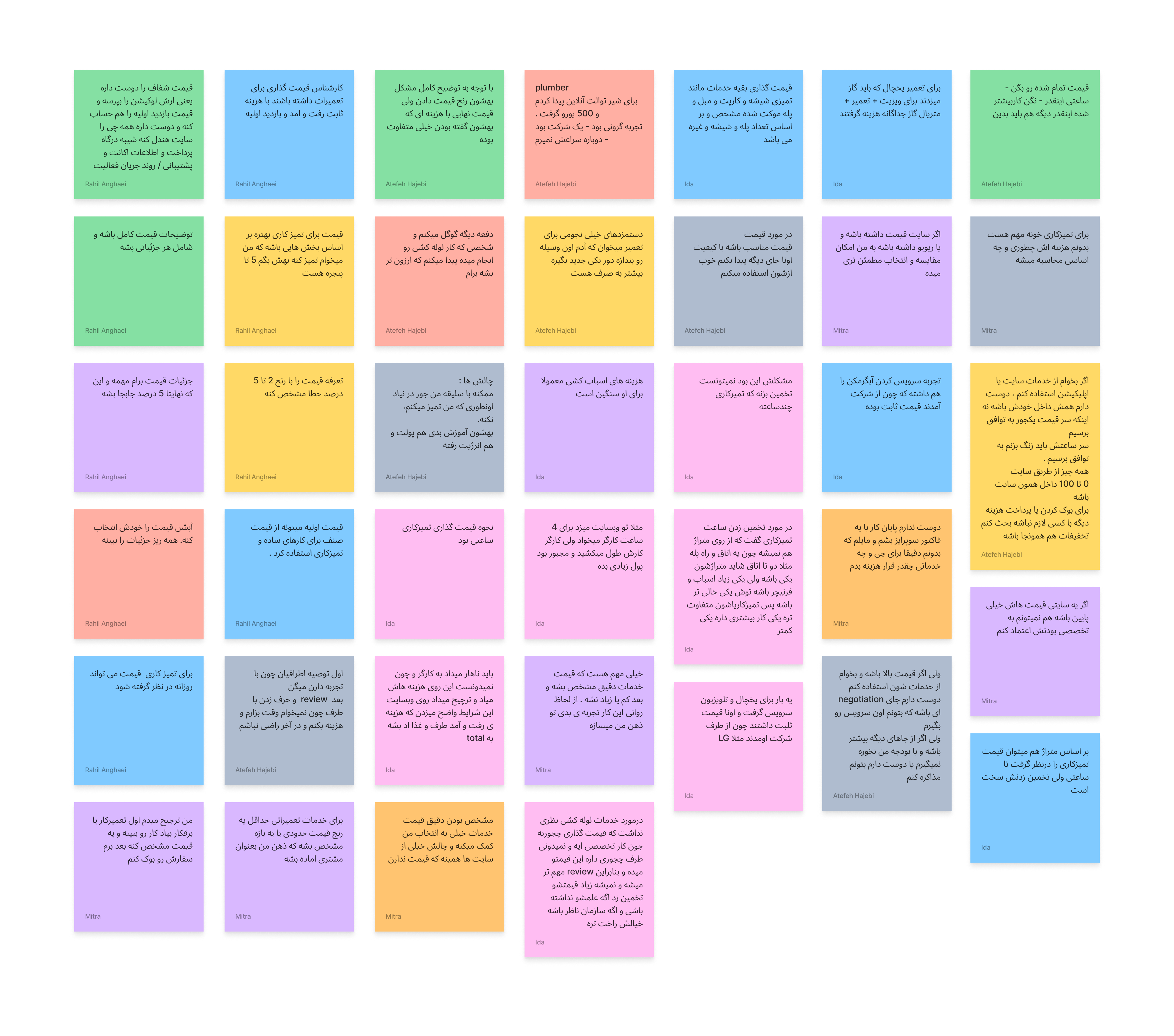
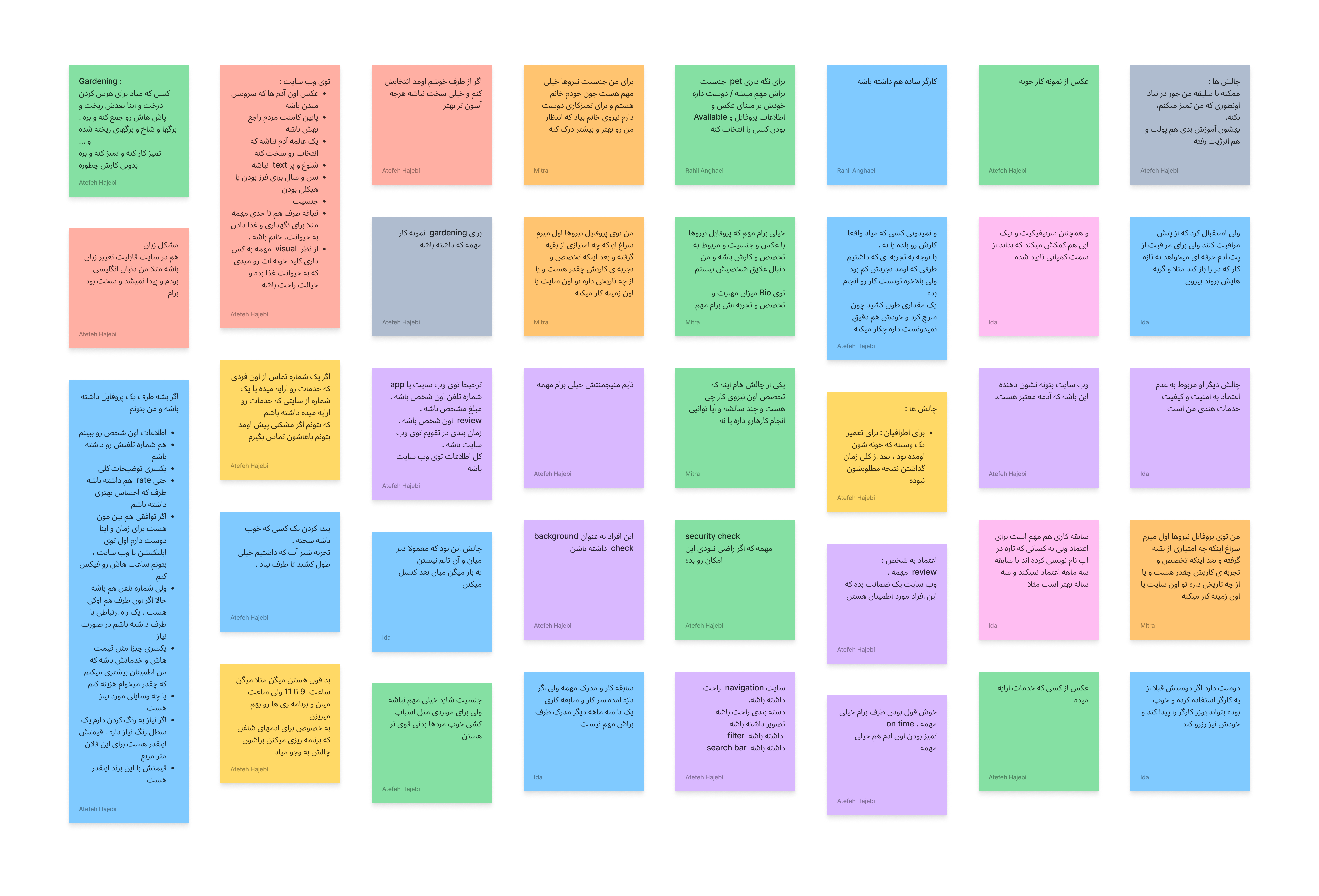
key insights from Interviews
20 people
Simple category: Users felt they lacked in-depth information about each service, so a simpler approach could be highly beneficial.
Technician Details: Users want to see a personalized profile for each technician, allowing them to choose based on skills, abilities, and reviews from others.
Cost: Users prioritize viewing the detailed breakdown of the price card. Having comprehensive information about each component helps them feel confident in using the services.
Local area: users like to access to services from their neighbourhood because of their more trust in a local and efficient timing.
Quotes
"Specify the tariff price with a margin of error ranging from 2 to 5 percent."
In the service description, it helps me to choose better if I know these information:
type of services
price
available dates
Rate & reviews
I once booked a plumber. He brought a new faucet and we only had two options to choose from. He also set the prices on the spot. I would have preferred to know the prices in advance and be able to compare them before making a decision.
Communication with the service provider is important to describe the issue and discuss costs or to get the tools.
It’d be better if it all is done via chat or email under the website’s supervision. So, in case of any issues, everything is taken care of by guarantees.
Competitve Analysis
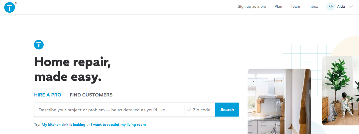
We compared potential competitors such as ThumbStack
The results indicate that the distance parameter is crucial, as people generally trust local experts more than those from other areas.
The research highlights that users need detailed service descriptions to make informed choices that best suit their needs.
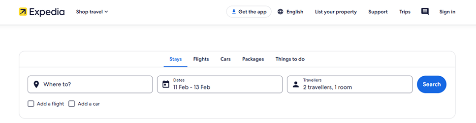
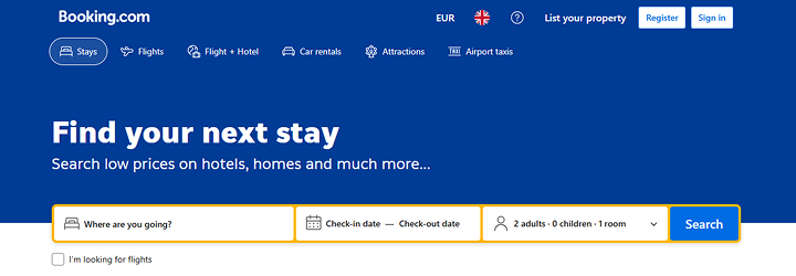
We need to design a global search bar to filter urgency, service categories, date and time and distance all at once and we found inspirations from Expedia.com and Booking.com
ThumbStack
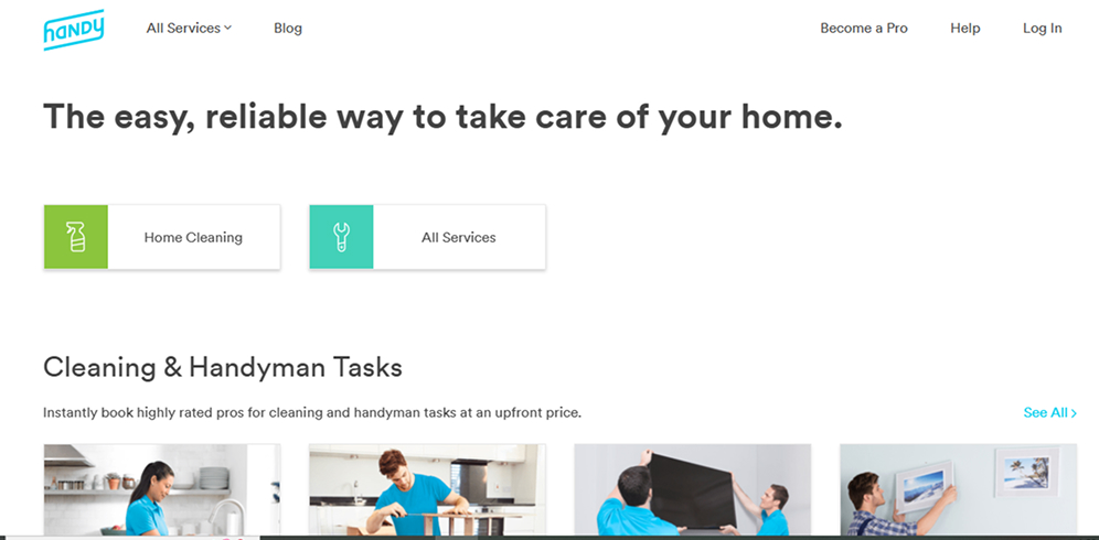
Handy.com
TaskRabbit
Fantastic Services
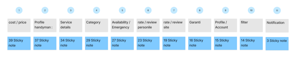
Affinity Diagrams
Interviewed 20 potential users
Cost/Price
Profile Handyman/Trust
Service Details/Trust
overall Key Takeaways
There are 3 important factors in which we need to consider in our design:
Kate is a working mother living with her two sons.she doesn’t have much free time, so she delegates some household tasks to service personnel to better manage her time.
Needs
The website offers a variety of services
good navigation
to access to history of purchased services
Pain Point
She needs to trust the person in case her pets are home.
Finding a website that provides transparent pricing.
Finding a website where services are consistently on time.
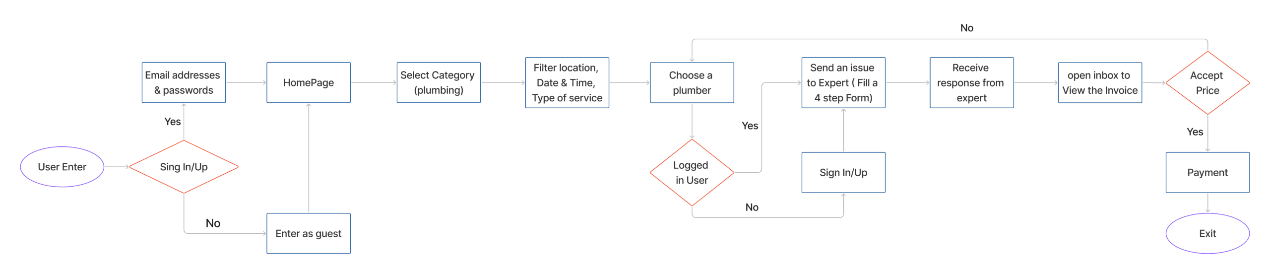
User Flow
Challenges & Solutions
Challenge 1
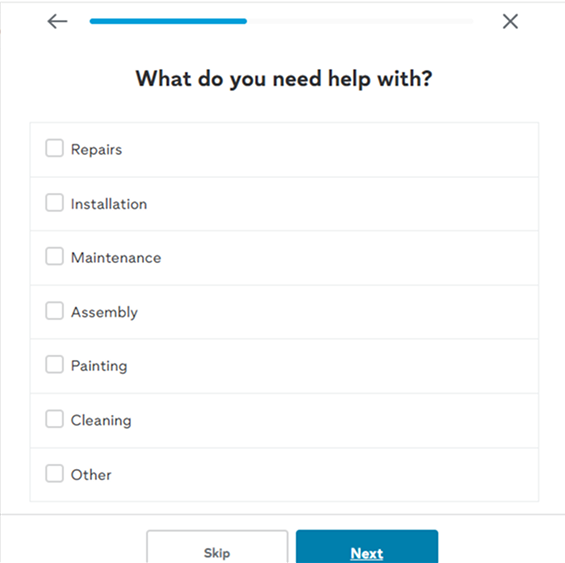
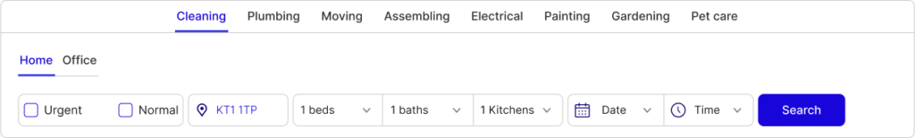
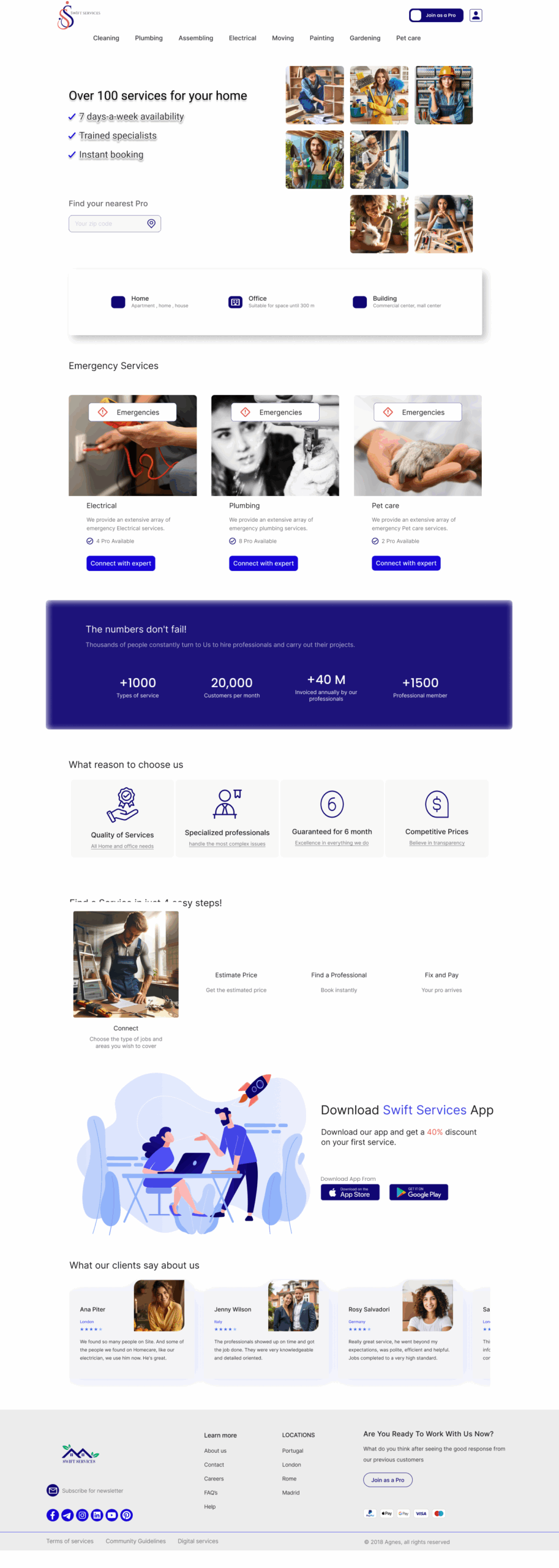
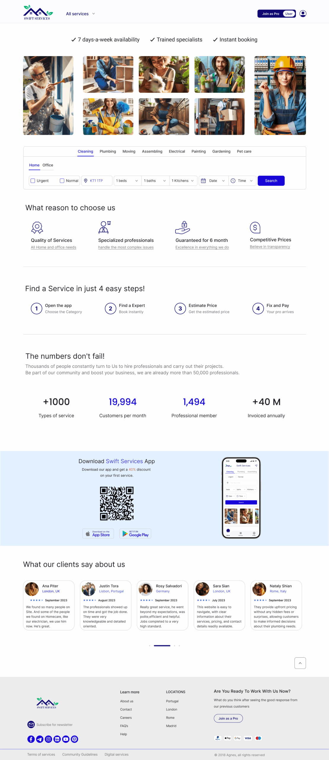
The first challenge was category filter and a global search bar to search for:
Category of services
Urgency
Location
Type of services
Times available
The Thumbstack and handy.com made these filterations separately and in two steps
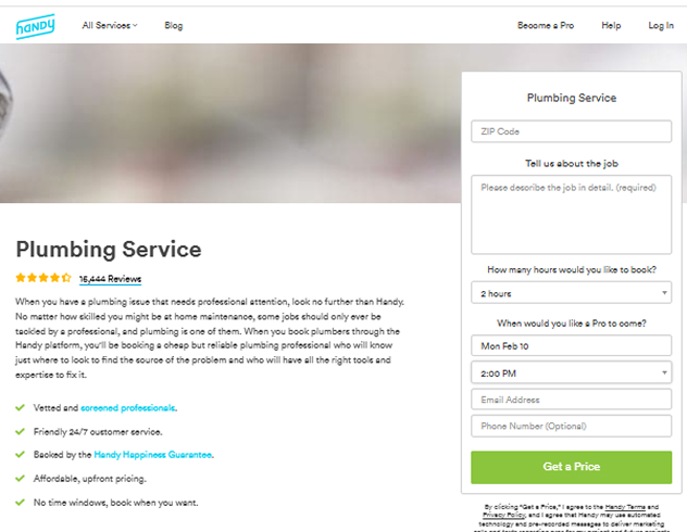
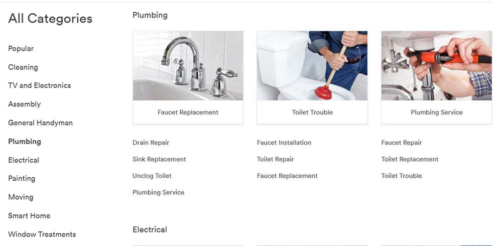
Analysing Handy.com for booking a cleaner:
Filtering based on category
Insert location
Pick time frequency
Insert house measurement
Service Type
Select Extra Service
Urgency and time
Select cleaner
Send contact request.
Expedia
Booking.com
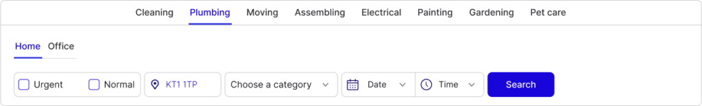
Our Solution:
By inspiration from Expedia.com and Booking.com websites: We designed a search bar that reduces extra clicks and makes the filteration for the users easier to grasb.
We aimed that user find any information right at the begining instead of proceeding to pick the cleaner and then realize the lack of availability in their neighbourhood or lack of urgency of serivces.
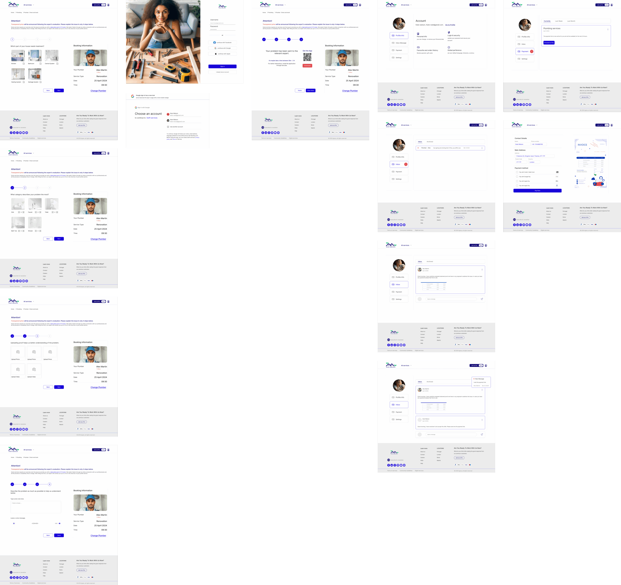
Challenge 2
The second challenge was providing Clear Cost information
During our researches, we figured out the costing of each category such as plumbing and cleaning are set differently.
For example, the cleaning cost is measured hourly. So, we offer cleaning packages and for less error, the cleaning time must is assessed based of the house measurement, plus, the amount of furniture and windows available in a room.
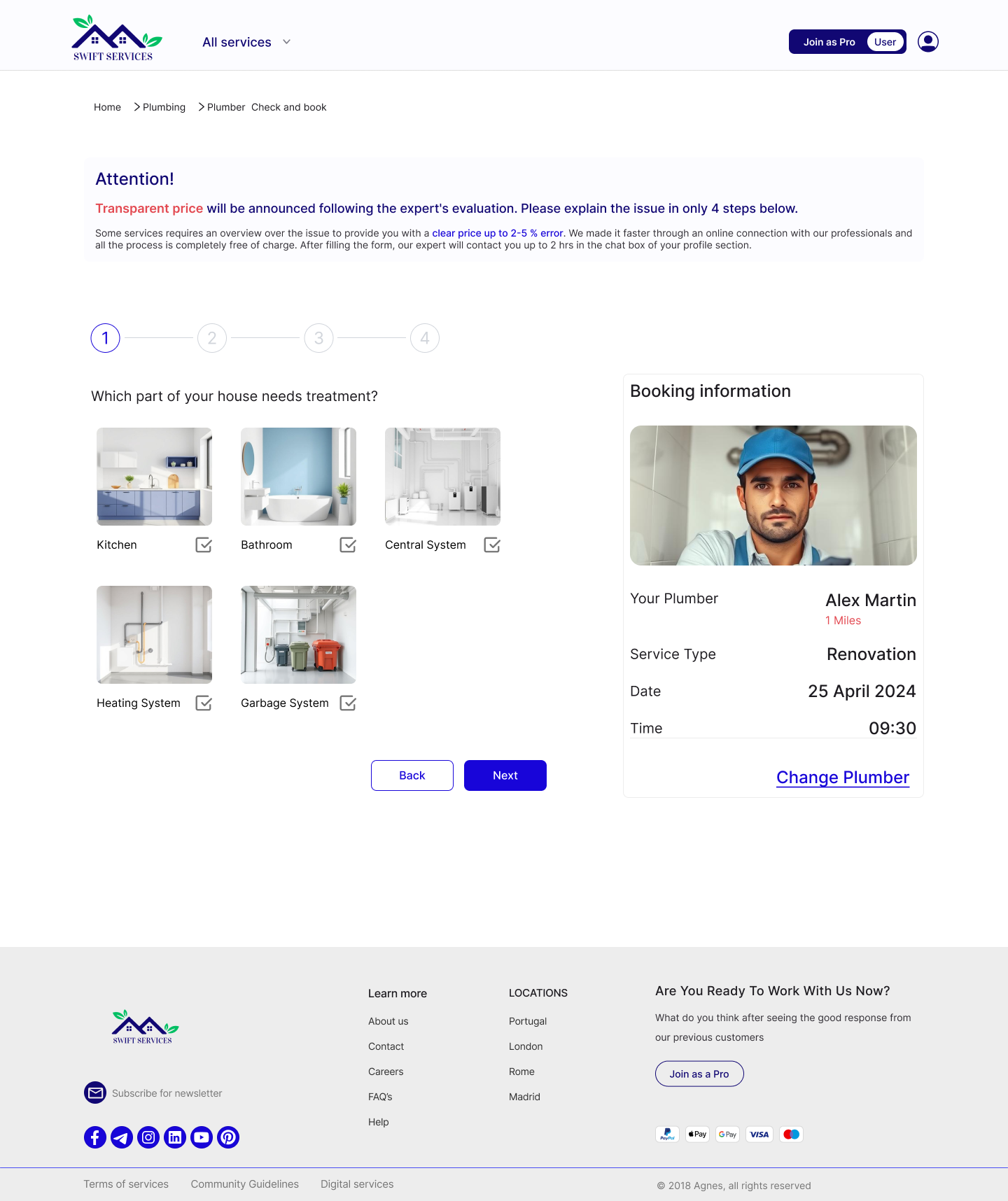
However, for the plumbing cost, an assessment of an expert over the issue is required to provide an offering cost with 2-5 % error. Therefore, it requires more time and the direct contact with the plumber.
Our Solution:
So, for booking plumbers, we considered an area that user can describe the issue and upload photos and videos to request for an online invoice.
And for booking cleaners, we considered packages, so user can pick form and also request for detergents or extra services.
Challenge 3
The third challenge was business Values and Customer Trust.
Challenge 4
The forth challenge was Customer Trust regarding choosing the handymen.
Iterations based on A/B Testing
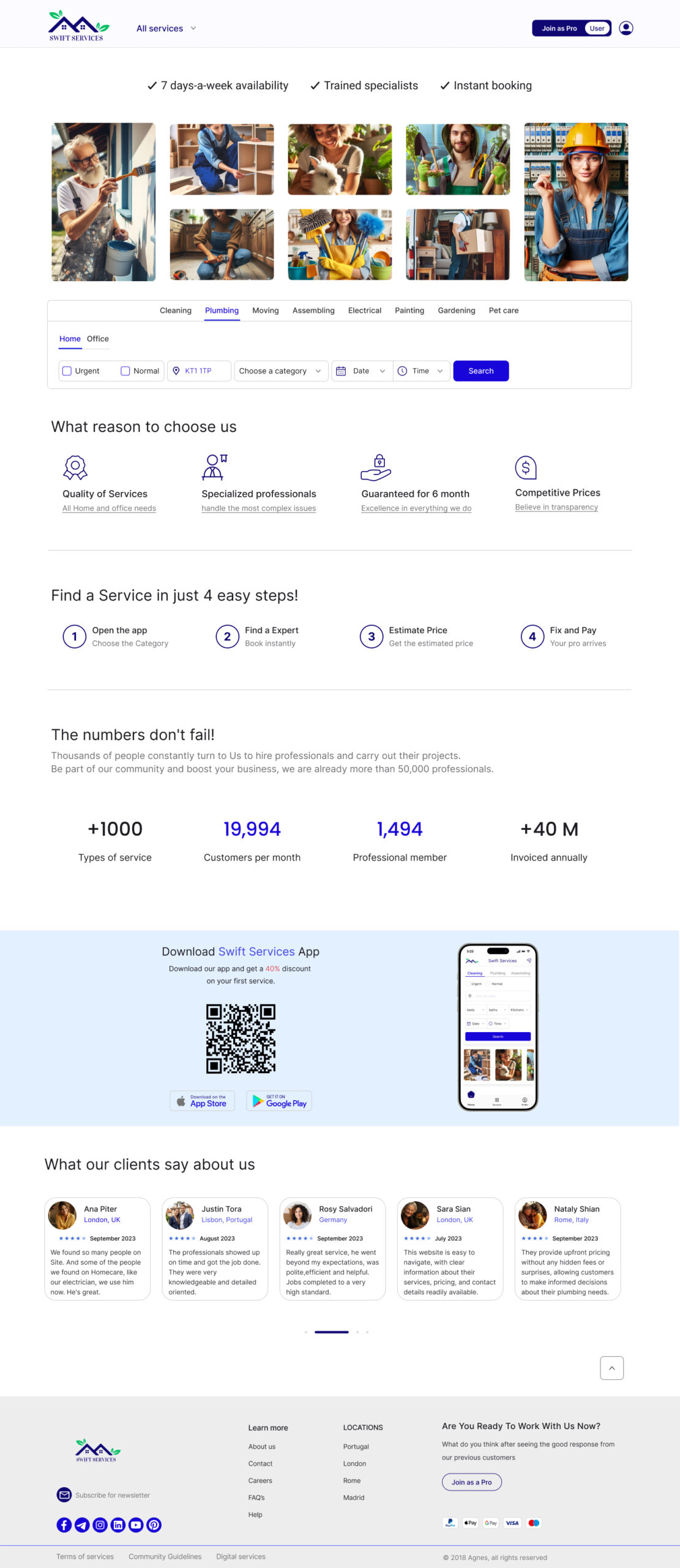
Home-Before
First, we inserted categories of services below the navigation bar and inserted a address search inside the Header section. But, during user tests, users were unable to notice the importance of these filterations and tend to neglect them.
Home-After
For the final version, we decided to create a global search bar in the homepage which gave users the ability to filter categories, location, date & time at once. Also, we made a shortcut category filter as All Services menu insdie the NavBar.
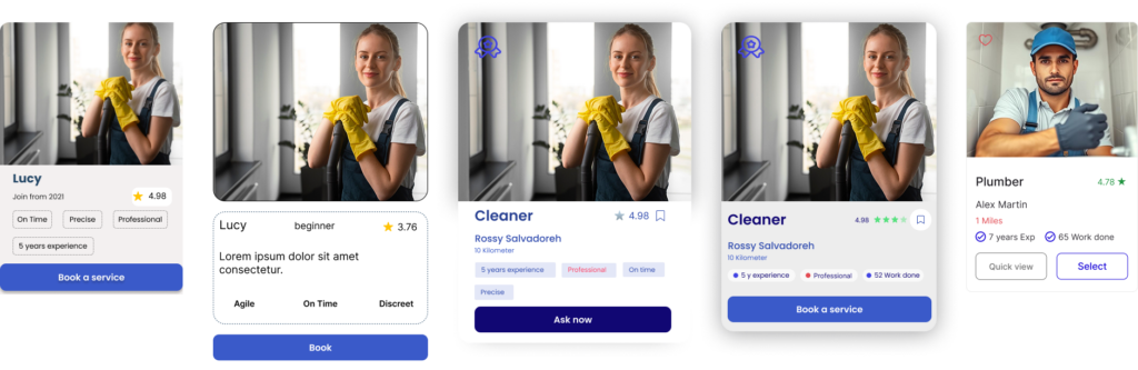
Cards-Before
Cards-After
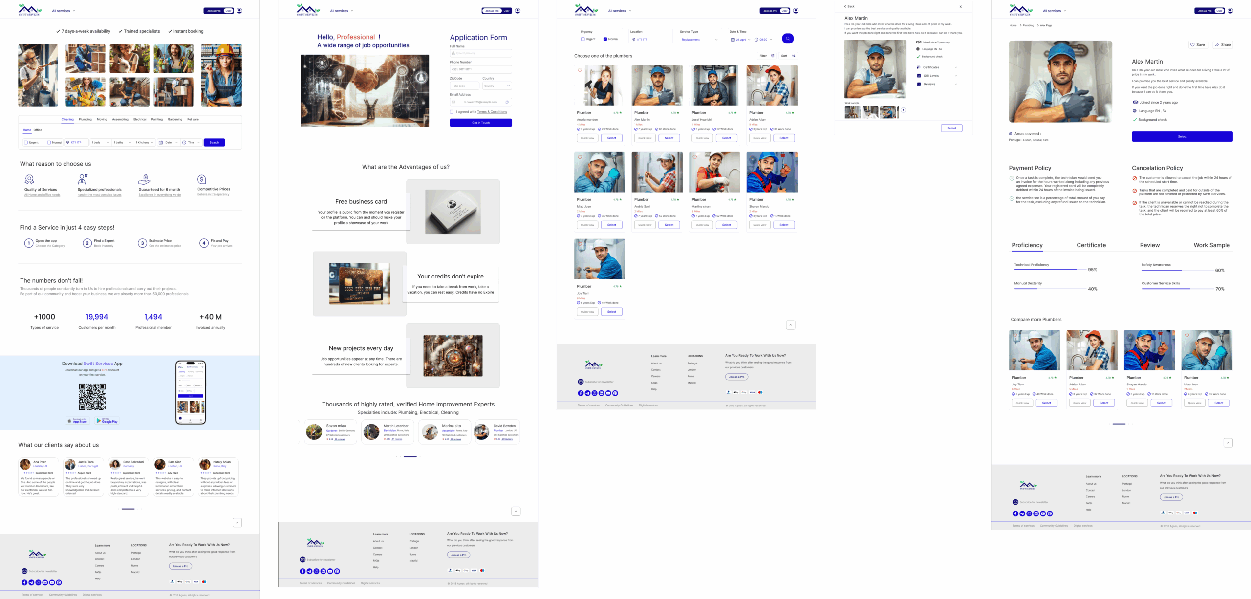
We first added profession label tags (ameture, expert, professional) on the cards to gain users trust and guide them in making choices but we figured out mentioning years of work experience are a better examination from users point of view.
We added distance of the technician to help users who proritize vicinity.
We also added Quick View button in case anyone needed multiple choices and to make the choice faster and easier.
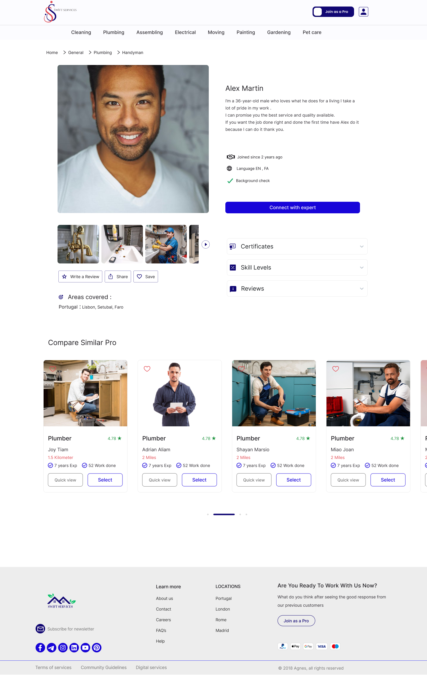
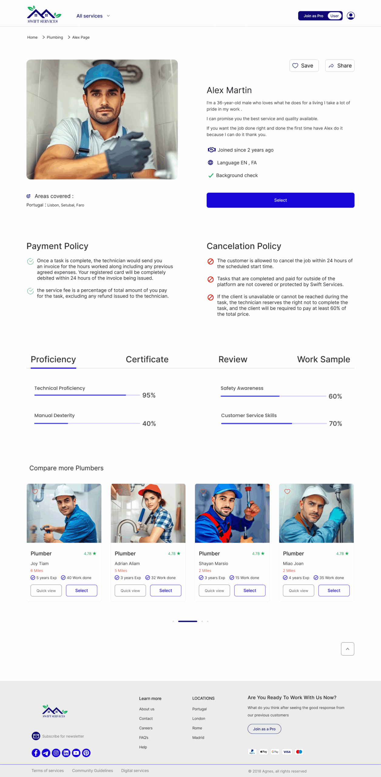
Technician-Before
At first, our mistake was to insert connect with expert button in the profile of technician. But, during usability tests, we realized users have a hard time to find this button and we concluded that it belongs to the next step when users are sending their problem to the expert that they are chosen.
Technician-After
So, we replaced Select button with connect with expert.
We added payment and calcellation policy but further users tests are being taken to figure out its best place.
For Certification and Reviews, users couldn’t figure out the function of drop-down menu. So, we replaced it with a segmented control to increase readiblity.
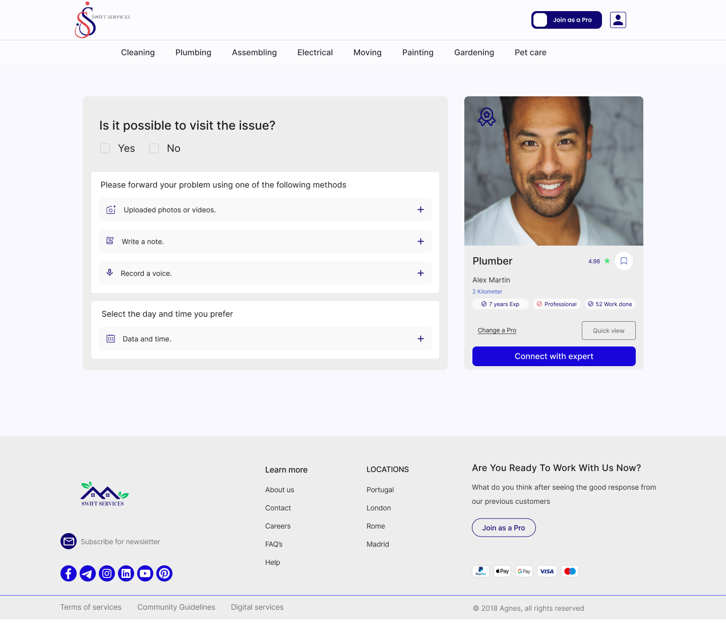
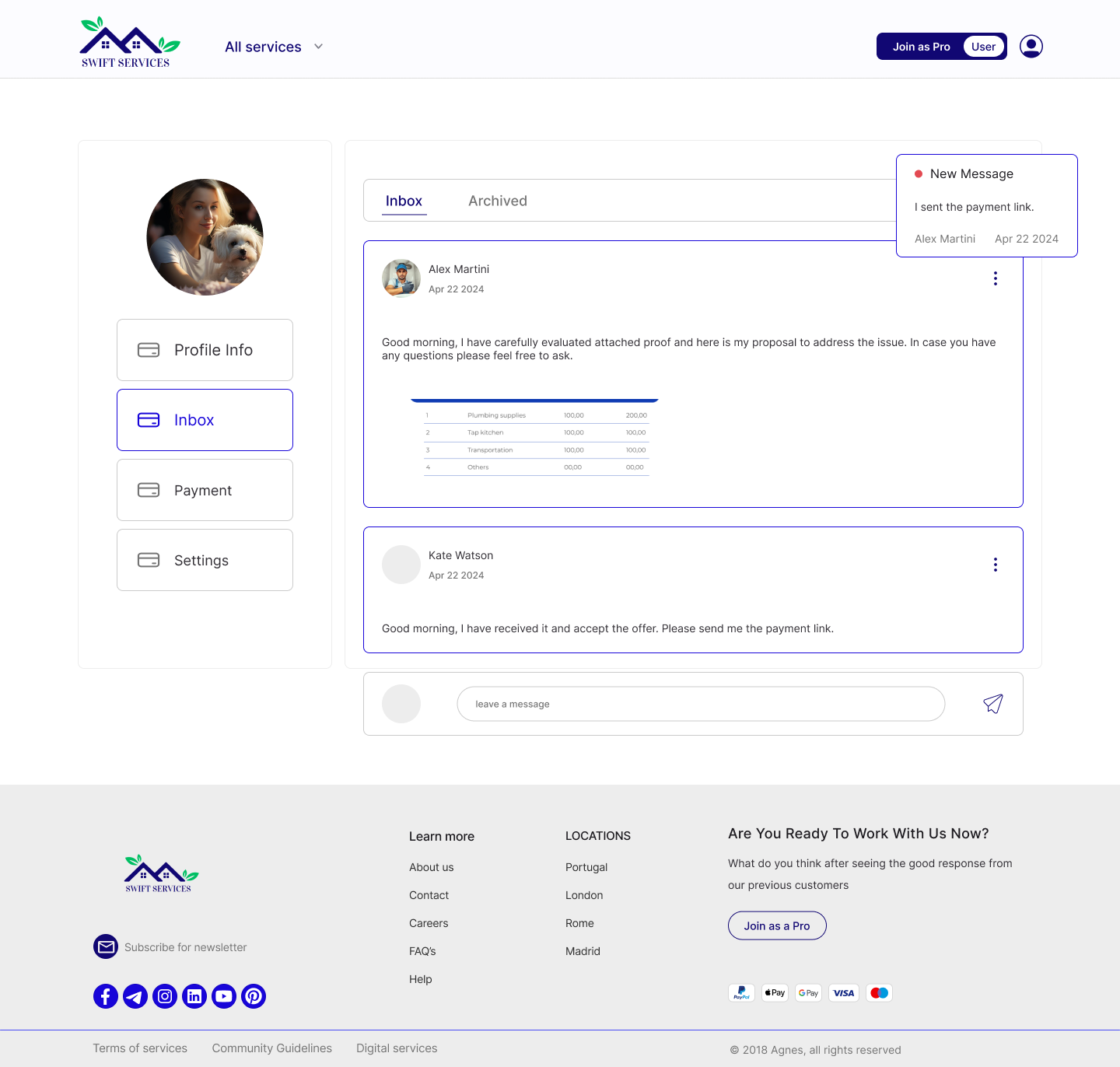
Connect with expert-Before
The section for providing pics and notes and sending invoice requests, was confusing and 70% of the users used to leave the task unfinished after choosing the technician.
Connect with expert-After
We added an Attention section to explain sending problem can help to get clear prices and save time.
Also, replaced the drop-down tabs in the form with a 4-step-form to avoid confusion.
For preventing from spam requests, we ensure only logged in users can send invoice request.
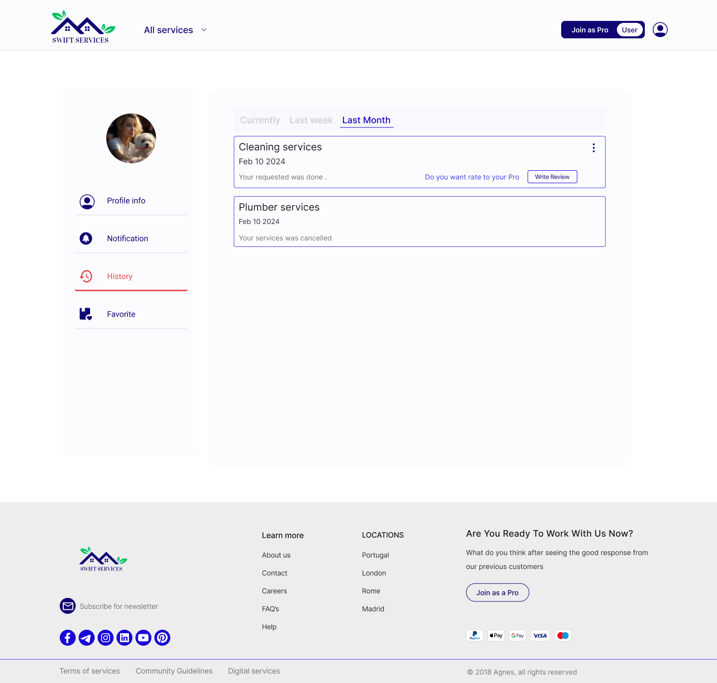
User Profile-Before
The function of notification tab was not clear for the users, at first. The History and favourite tabs were not in the business priority.
User Profile-After
So, we changed it into inbox and payment in the shortcut menu (most in use features by users) and moved the history tab to the profile info tab.
High-Fidelity
like to keep in touch?
Please write to the email address below or contact me me via social platforms: